Why won't my QR code scan?
A QR code that worked on screen and fails on paper has usually lost something in the printing: the margin, the contrast, or the size of each square. The pattern itself rarely breaks. Here are the six causes, in the order they tend to bite, with a real code showing each one.
Start with the phone, it is free to rule out
Before blaming the code, try the things Google lists in its own troubleshooting notes: turn on more light, get the glare or the shadow off the code, move it onto a plain surface if it is sitting on a busy pattern, wipe the camera lens, hold the phone about a foot away and move slowly closer, and keep the phone level with the printed surface rather than at an angle. Apple's instructions are the same in spirit: frame the code in the camera and, if the light is poor, turn on the flashlight.
If a second phone reads it and yours does not, the code is fine.
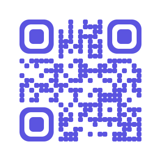
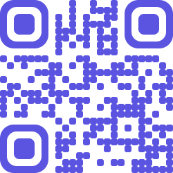
1. The white margin is part of the code
A QR code needs empty space around it. Denso Wave, which invented the format, puts it plainly: the code "requires a four-module wide margin at all sides". A module is one of the little squares. That margin, the quiet zone, is how a scanner finds where the code begins, and GS1 requires the same four modules for retail codes. Micro QR is the exception, needing two.
Designers delete it constantly, because it looks like wasted space in a layout. It is the most common reason a code scans in the design file and not on the flyer.
2. Contrast, and why dark on light
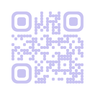
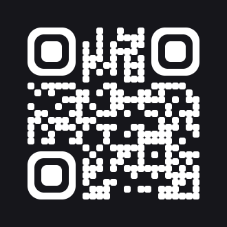
The standard is written for dark modules on a light background. Inverting it, light on dark, is allowed as an option, and a decoder is only required to retry an inverted reading when it cannot find a normal one. So an inverted code may work on your phone and fail on a customer's. Pale colours are worse: there is no official minimum contrast figure, but a code the camera cannot separate from its background is not a code.
3. Size is about modules, not centimetres
There is no official rule that says a code must be a certain size at a certain distance. The popular "divide the scanning distance by ten" is a rule of thumb, not a standard. What matters is how big one module ends up, because that is what the camera has to resolve. Denso Wave says a module should be at least four printer dots, and that every scanner has its own limit.
GS1, for codes on consumer packaging meant to be read by phones, sets the module between 0.396 mm and 0.990 mm. Their own worked example: a 29 by 29 code at the smallest allowed module, with its quiet zone, comes out about 14.7 mm square. Google's scanning library asks for at least two camera pixels per module, which is the same idea from the phone's side.
Practical version: print it bigger than looks necessary, and test the real print, not the PDF on your monitor.
4. Long URLs make dense codes
A QR code grows in fixed steps, from 21 by 21 modules up to 177 by 177, four modules at a time. More characters means more modules, and at a fixed physical size, more modules means each one is smaller. Codes generated with our own encoder, same settings:
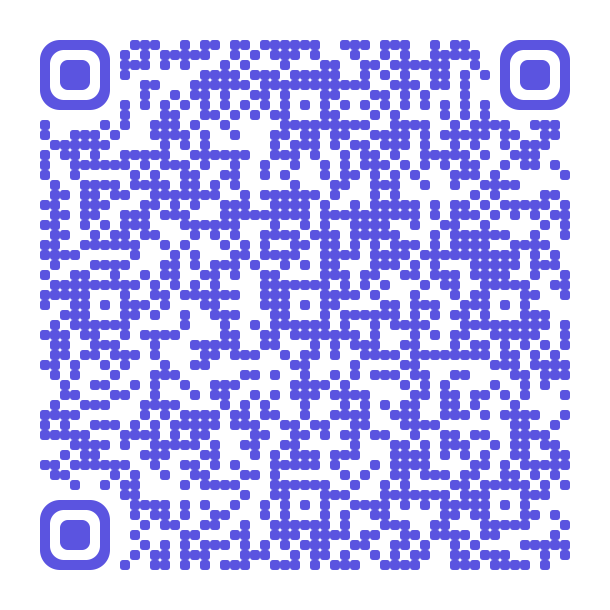
This is the easiest fix on the list. Put the long URL behind a short link and the code gets sparse again, and you can change where it points afterwards.
5. Error correction, and the logo that spends it
QR codes carry redundancy so a scuffed or partly covered code still reads. There are four levels, and Denso Wave's own figures are that they restore roughly 7%, 15%, 25% and 30% of the codewords. Level M is the usual choice. The catch is that redundancy takes room: the same data at a higher level needs a bigger code.
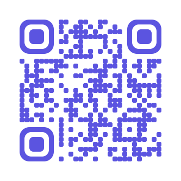
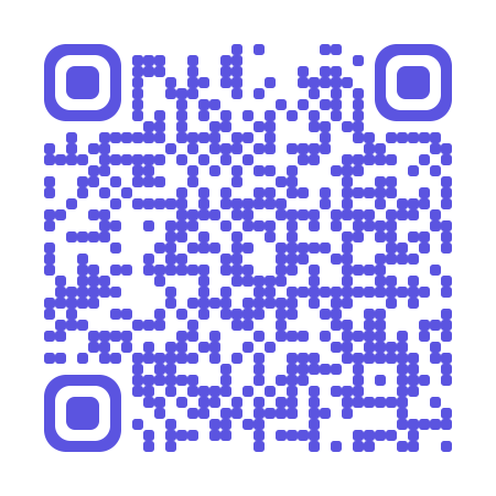
About logos in the middle: no standard says how much of a code you may cover. The "30% at level H" figure repeated everywhere is the codeword percentage, misread. And that redundancy has a job already, which is surviving rain, scuffs and a sticker corner. Spend it on a logo and there is less left for the world. Denso Wave's own answer to the design problem is a separate format, FrameQR, with a space designed not to interfere.
A small logo at level H is usually fine. Test the printed code before the run, not after.
Before you print
- Keep four modules of clear space on all sides.
- Dark code on a light background, with real contrast.
- Print a test at final size, on the real material, and scan it from the distance people will stand.
- Scan it with a cheap phone, not only your own.
- Shorten the URL so the code stays sparse.
- If there is a logo, keep it small and raise error correction.
- Matte beats gloss. Glare is a real failure mode outdoors and under shop lighting.
What our codes do about it
The free QR generator needs no account and nothing is stored. This one is styled and still follows every rule above: brand colours with real contrast, four modules of quiet zone, a small centre badge, and the highest error correction because the badge covers modules.
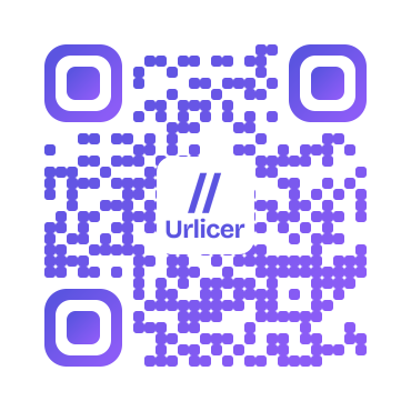
Behind it:
- The four-module quiet zone is always there. It is not an option you can switch off.
- Colour combinations that fail a contrast check fall back to black on white, and the app says why, instead of handing you a pretty code that will not scan.
- Adding a centre logo switches the code to the highest error correction level automatically.
- Codes made from a short link stay sparse: 25 by 25 for ivi.to/menu, against 53 by 53 for the raw campaign URL.
Styling (colours, shapes, frames) is on every plan including free, with PNG download. SVG, which is what a printer will ask you for, is on the paid plans. If the code is going on something printed, read how to make a QR code for a poster, flyer or product label, and do QR codes expire if you want to know whose codes stop working and why.
Need a code that will still work next year? Make it in a free account, so you can change the destination without reprinting.